Chapter 3 of 6
From Pencil Sketch to Finished Logo
Follow the Brand Forge pencil studies, simplified digital silhouette, and finished gold identity.
Eric Bryden · Founder of Draconic Realms Creations
Move from exploring meaning to testing clarity. Each stage should keep the idea while removing detail that stops the mark working at smaller sizes.
The Brand Forge identity brings the dragon, open book, and anvil together—from exploring symbols to simplifying the mark and finishing the full logo.
01 / AI-assisted teaching illustration
Pencil sketches
The dragon explores imagination and movement. The open book brings storytelling and learning into the mark. The anvil gives the combined symbol a foundation: ideas shaped through craft. These studies compare the separate forms before bringing them together. 02 / AI-assisted teaching illustration
Digital refinement
The outline becomes a simpler silhouette. Extra pencil detail is removed, the dragon's curve is clarified, and the gaps between the dragon, pages, and anvil become more deliberate. Comparing the outline with solid ivory and gold versions helps reveal where spacing needs to stay open. 03 / THE FINISHED IDENTITY
Finished logo
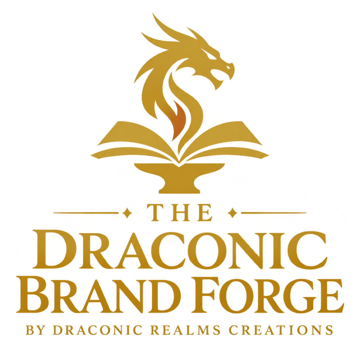
The full antique-gold logo combines the emblem, The Draconic Brand Forge name, and Draconic Realms Creations credit. Midnight navy gives the complete identity the contrast it needs.